ShopDreamUp AI ArtDreamUp

Deviation Actions


Suggested Deviants


Suggested Collections


Description
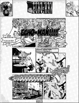
November, 2000.
This is a sample of my graphic adaptation of title pages of classic comic books for the spanish editions. Bear in mind that I had to fill the room of indicia because it belongs to a TPB.
The image of the middle is the previous step. I lettered it with computer over a low res scan of the comic book USA.
After it was done, I printed the elements with a laser copier and then I pasted them down over the stat provided by Marvel. Afterwards, I had to complete the drawing of the holes between the characters of the title and the room of the staff. I also retouched the characters with a rapidograph to mimic the strokes of a marker.
Back then I was already happy with the final look of this kind of title pages, because I think that they were quite faithfully to the original work by Simek and Rosen. Furthermore, I already had a nice stock of fonts created from samples of the original lettering.
These samples would be used later by Comicraft to generate a line of retro fonts. The same fonts used by the letterers nowadays to do this kind of work in modern editions.
---------------
Btw, I had nothing to do with the lettering of the balloons. I'd never use the Wildwords font for a retro job like this one. I only lettered the caption, because it was considered of part of my job. Of course, I used a font based on Rosen's style, which was a contrast with Wildwords.
Image size
2948x1478px 4.28 MB
© 2013 - 2024 ferrandelgado
Comments0
Join the community to add your comment. Already a deviant? Log In